 |
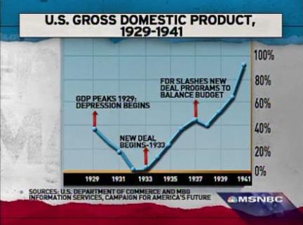
Apparently the above graph was used on the Rachel Maddow show this past Monday. This seems to be a pretty strong statement about the history of the depression years. I await to see what the opposition to economic stimulus can come up with to refute the implications of this graph. (I must admit the scale to the right of the graph makes no sense that I can divine. However, pay no attention to the numbers that prove Greenberg’s Law of the Media.)
Follow this link to the Huffington Post story about how Representative Steve Austria had to retract his claim that President Roosevelt caused the depression.
As of Feb 13, 2009, I have sent an email to Rachel Maddow asking her to explain the graph. The more I view other statistics about the depression the more I grow suspicious about the meaning of the graph.